Adobe Indesign, 2024
This interactive website allows the user to interact with text from the poem “From Blossoms”.
“From Blossoms” was the first poem that ever got stuck in my head, especially the last stanza.
The way the last lines sound when I read them aloud—beat, pause, beat, pause, beat, beat,
pause, beat, beat, beat—are so important to the way I feel about this poem. The interactions in
my website, each click, are inspired by that rhythm. I was inspired by the romantic, flowy, and
natural designs from the Arts and Crafts movement and Victorian fairytale illustrations.
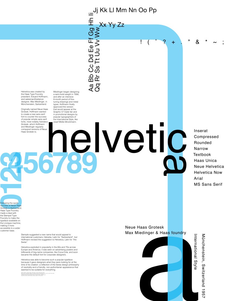
For my first poster design I chose to represent Helvetica. I really struggled in the beginning to make my poster both interesting and simple. I started with using a grid system because the Swiss designers loved the grids and I kept my background white like many other Swiss-style designs. I realized when working with the grid the poster didn’t fit in today’s time and there was too much focus on the text itself and not on the space it was creating. I was using the white background as a background and not an element of my design (which is what people praise Helvetica for—that the counters and space around the letterforms are what’s holding the letterforms). I scrapped the grids and flipped through books for inspiration. I was inspired to use curves in my design by the 1972 NYC metro map, which used Helvetica. I still kept my design simple and only used three weights and three colors. But I was still able to create contrast and really emphasize negative space.
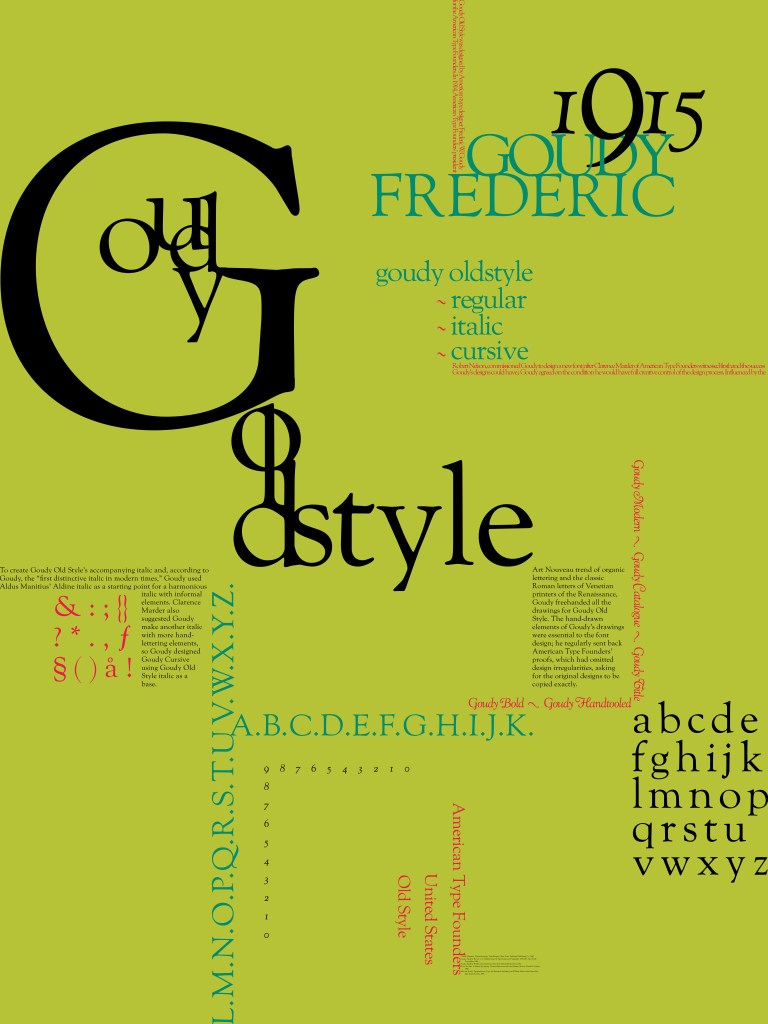
My second font is Goudy Oldstyle by Frederic Goudy. Goudy Oldstyle is completely hand-drawn and features many of those original hand-drawn elements. Because of this, I had a lot of fun playing around with the letters and fitting them together. My composition overall is modern but most of the little detail choices—like the soft, warm colors popular during the Art Nouveau movement—reference either Goudy’s work or the American Type Founder’s 1923 specimen book. My favorite part of this poster is how I recreated decorative embellishments for blocks of texts found all over Goudy and ATF’s designs by using text itself. Another detail I want to highlight is the way the descender of the number 9 goes through the letter D. This is a reference to Goudy’s book “The Alphabet” and the way his letters often broke barriers like this. Although I kept my composition modern, I believe it compliments the hand-drawn font I chose and contrasts the historical references I included.
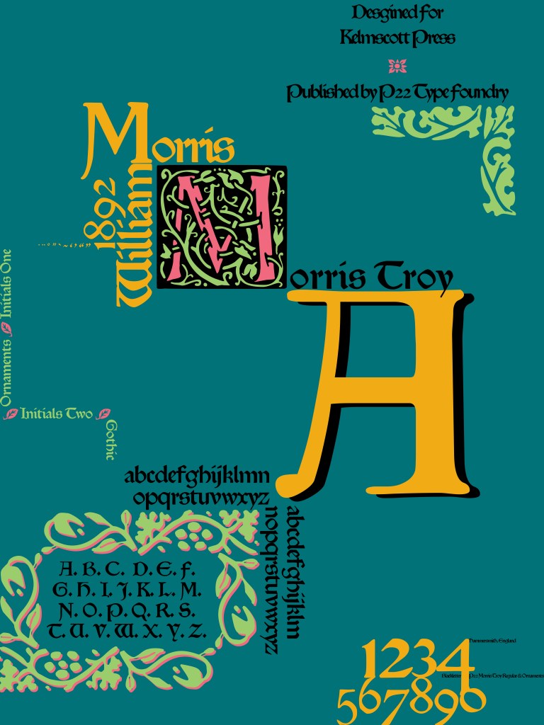
My final font is Morris Troy by William Morris. Morris made this font for his publishing company, the Kelmscott Press, during the gothic revival in England. I gathered a lot of inspiration from Kelmscott books and illuminated manuscripts from the Middle Ages. My biggest inspiration for the overall composition were William Morris’s trellis wallpapers. I was able to arrange my text so that the negative space created a grid and then I weaved some nature-y ornaments throughout.
